


What is a Call Flow Visualizer?
A Call Flow Visualizer is a tool that visually maps out the complete route of a phone call. Instead of clicking through multiple portals or configurations (such as auto attendants, call queues, or routing rules), you get a single clear overview in the form of a diagram or flowchart.
Such a visualization shows step by step what happens from the moment someone dials a number until the call is answered, forwarded, or ended.
A call flow itself is essentially the “journey” that a call takes within a telephony system – including all decision points and routes along the way.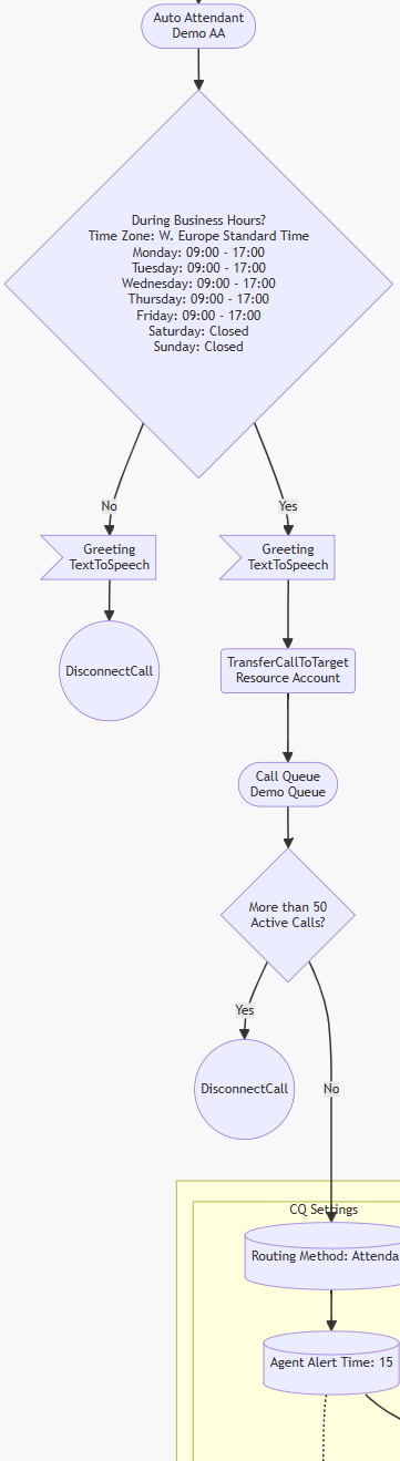
Why is this useful?
In environments like Microsoft Teams Phone or contact centers, a call flow can quickly become complex:
- Auto Attendant → menu selection
- Forwarding to Call Queue
- Overflow to voicemail or other queue
- Time-based routing (office hours vs. closure)
Without visualization, that logic is scattered across different configurations. A Call Flow Visualizer brings everything together in one overview, so you instantly see:
- How an incoming call is handled
- Where calls go with each choice
- Where potential bottlenecks or errors are located
Tools like an M365 Call Flow Visualizer read configurations (e.g., Auto Attendants and Call Queues) and automatically convert them into a diagram.
How does a Call Flow Visualizer work?
The process typically consists of three steps:
1. Reading source data
The tool retrieves configuration data from the system, for example:
- Teams Auto Attendants
- Call Queues
- User settings
- Routing rules
In some tools, this is done via PowerShell or APIs, in others through exports or configuration files.
2. Analyzing logic
The tool interprets the call flow and converts it into “nodes” and “paths”:
- Nodes = steps in the flow (menu, queue, voicemail, user)
- Decisions = choices (e.g., “press 1”)
- Routes = connections between the steps
This closely resembles a classic flowchart model where each step and decision is visually represented.
3. Generating visualization
Finally, a diagram is created, often with technology like:
- Flowcharts (classic)
- Mermaid diagrams
- Interactive graphs
The output can be:
- An image (PNG/SVG)
- An interactive visualization
- Documentation (e.g., Markdown or HTML)
Some tools also allow filtering or zooming, so you can better analyze large environments.
Practical example
Without a visualizer:
You have to click through:
- Auto Attendant
- Submenu
- Call Queue
- Overflow rules
With a visualizer:
Incoming call
   ↓
Auto Attendant
   ├── 1 → Sales Queue → Agents
   ├── 2 → Support Queue → Overflow → Voicemail
   └── 0 → Operator
At a glance, you see the full flow.
Typical use cases
A Call Flow Visualizer is mainly used for:
-
Documentation
→ “How does our main number actually work?” -
Troubleshooting
→ Why doesn't a call reach its intended destination? -
Design & optimization
→ Where can we improve routing? -
Transferring to colleagues/customers
→ Making complex setups understandable
Summary
A Call Flow Visualizer:
- Converts complex telephony configurations into clear diagrams
- Shows you how calls actually traverse the system
- Helps with troubleshooting, documentation, and optimization
In short:
It is the tool to move from “black box” telephony to a transparent and comprehensible call flow.
Example

```